
URBAN ECK
URBAN ECK
BRANDING
Challenge
Urban Eck GmbH, a Swiss architecture firm, needed a unified brand identity that matched their precision and architectural expertise. Their visuals lacked clarity and modernity, making it hard to stand out. They sought a system that conveyed trust, structure, and professionalism across digital and print.
Goal
Our aim was to create a cohesive brand identity reflecting Urban Eck’s values: vision, planning precision, and Swiss-quality standards. It had to feel confident yet approachable, adaptable across all touchpoints—from signage and stationery to digital platforms.
Solution
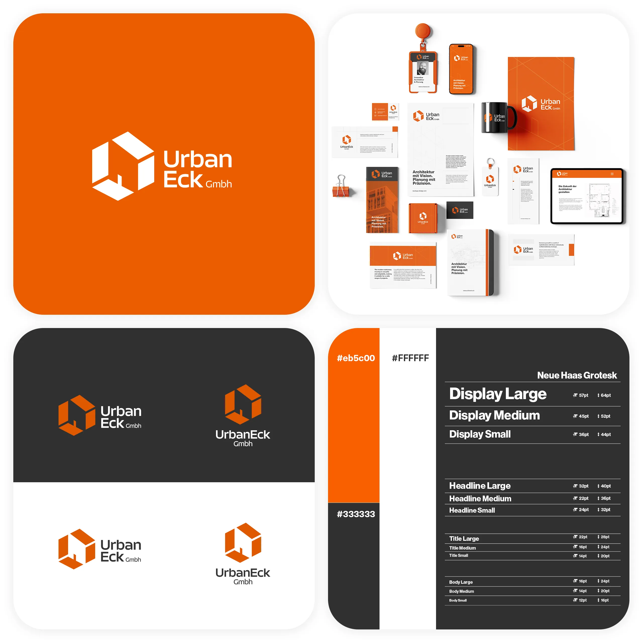
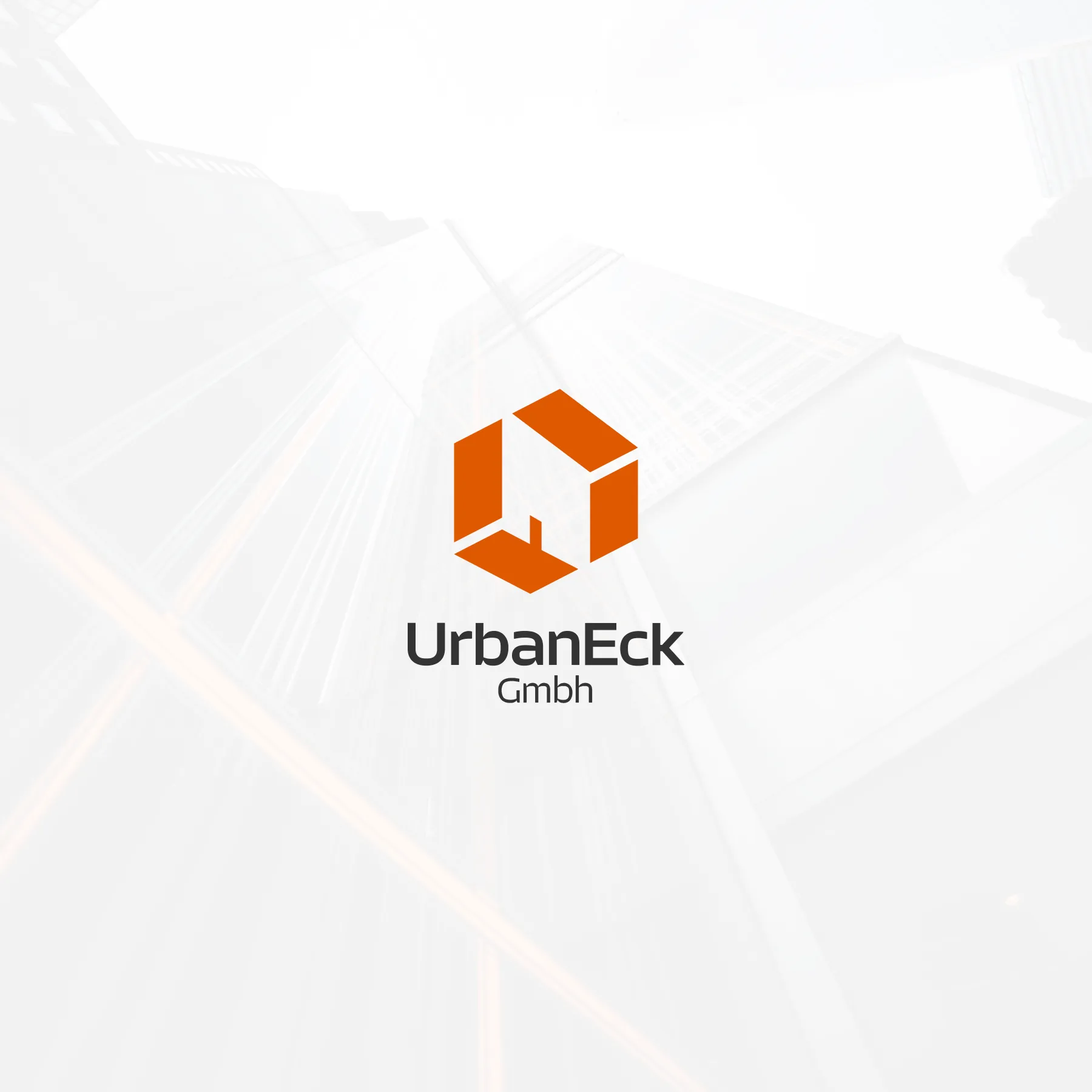
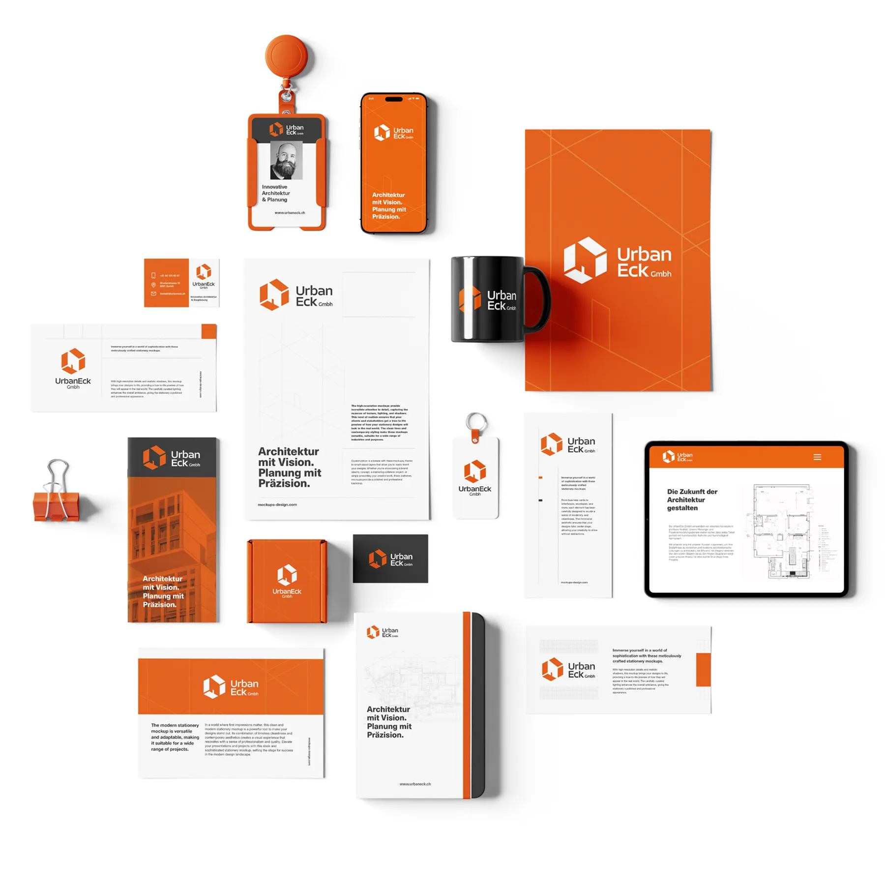
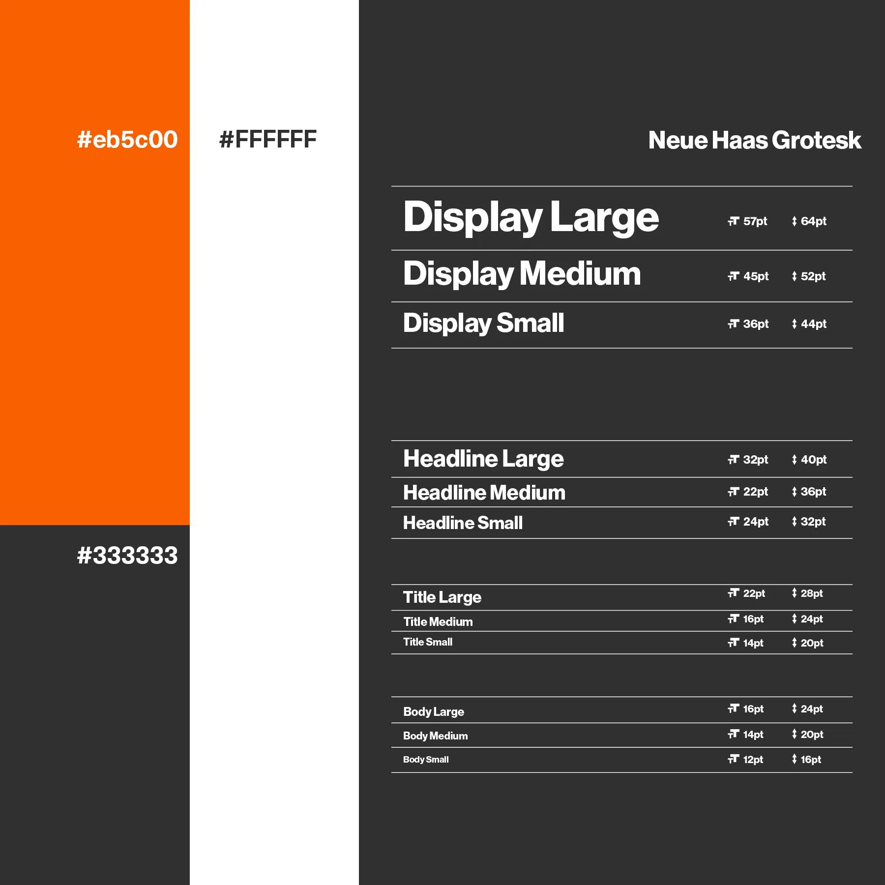
We designed a geometric, modular logo inspired by architecture and the concept of “Eck” (corner). The identity uses Neue Haas Grotesk typography, a minimalist grid system, and a palette of warm orange with classic black and white. The result is a timeless, professional brand system that reflects Urban Eck’s ethos and scales confidently across formats.
GAllery

CONTACT INFO
North Macedonia

