
M-TRANSPORT
M-TRANSPORT
BRANDING
Challenge
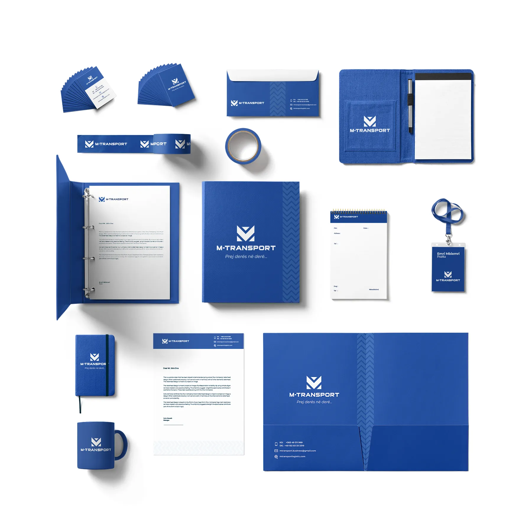
M-Transport, a fast-growing logistics company, needed a bold identity that reflected strength, structure, and movement. The goal was to stand out in the transport sector with a visual system that communicated clarity and consistency across all brand touchpoints.
Goal
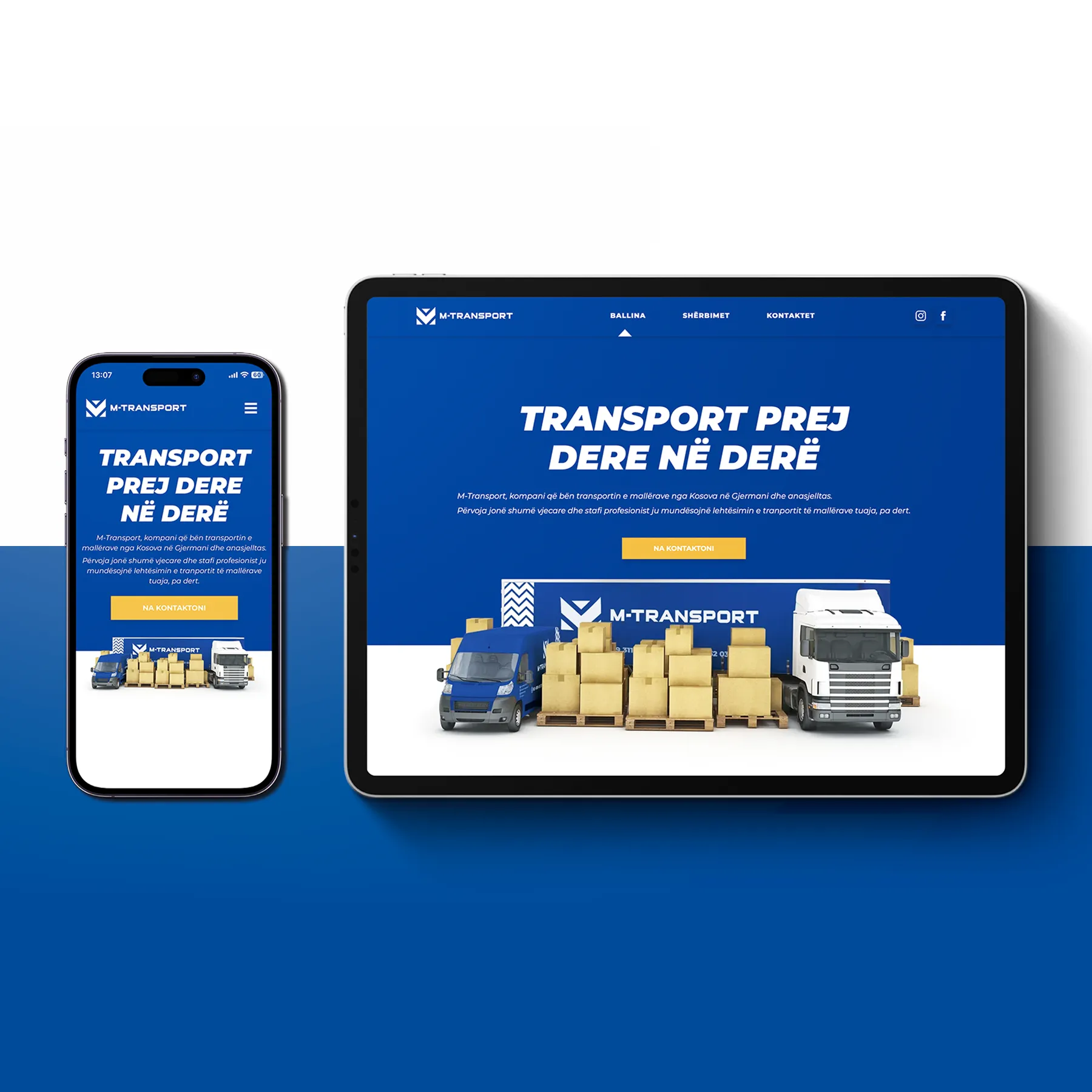
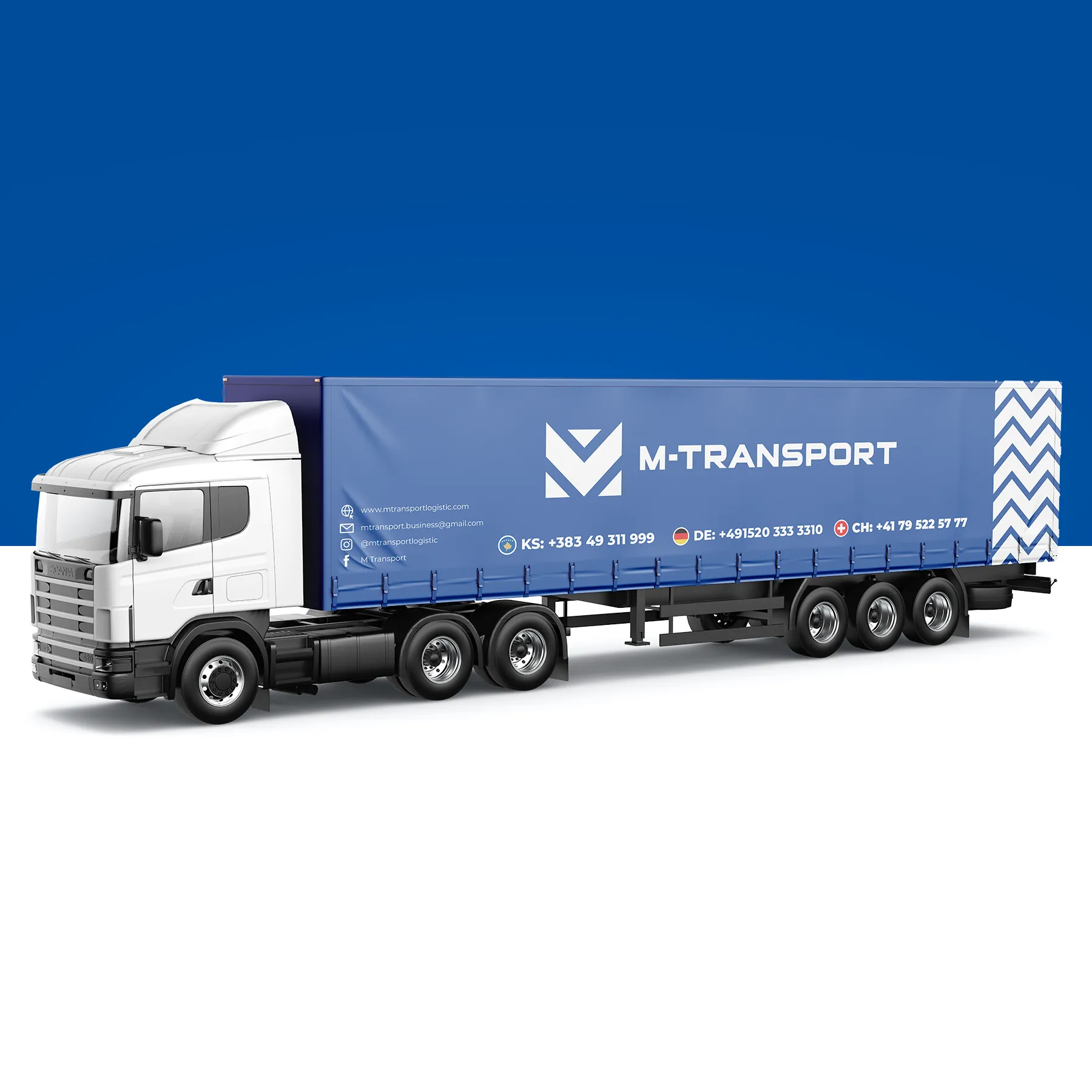
The aim was to design a brand that felt strong, reliable, and directional—yet modern enough to support the company’s digital evolution. The system needed to scale across web, fleet, and promotional use while reinforcing trust and momentum.
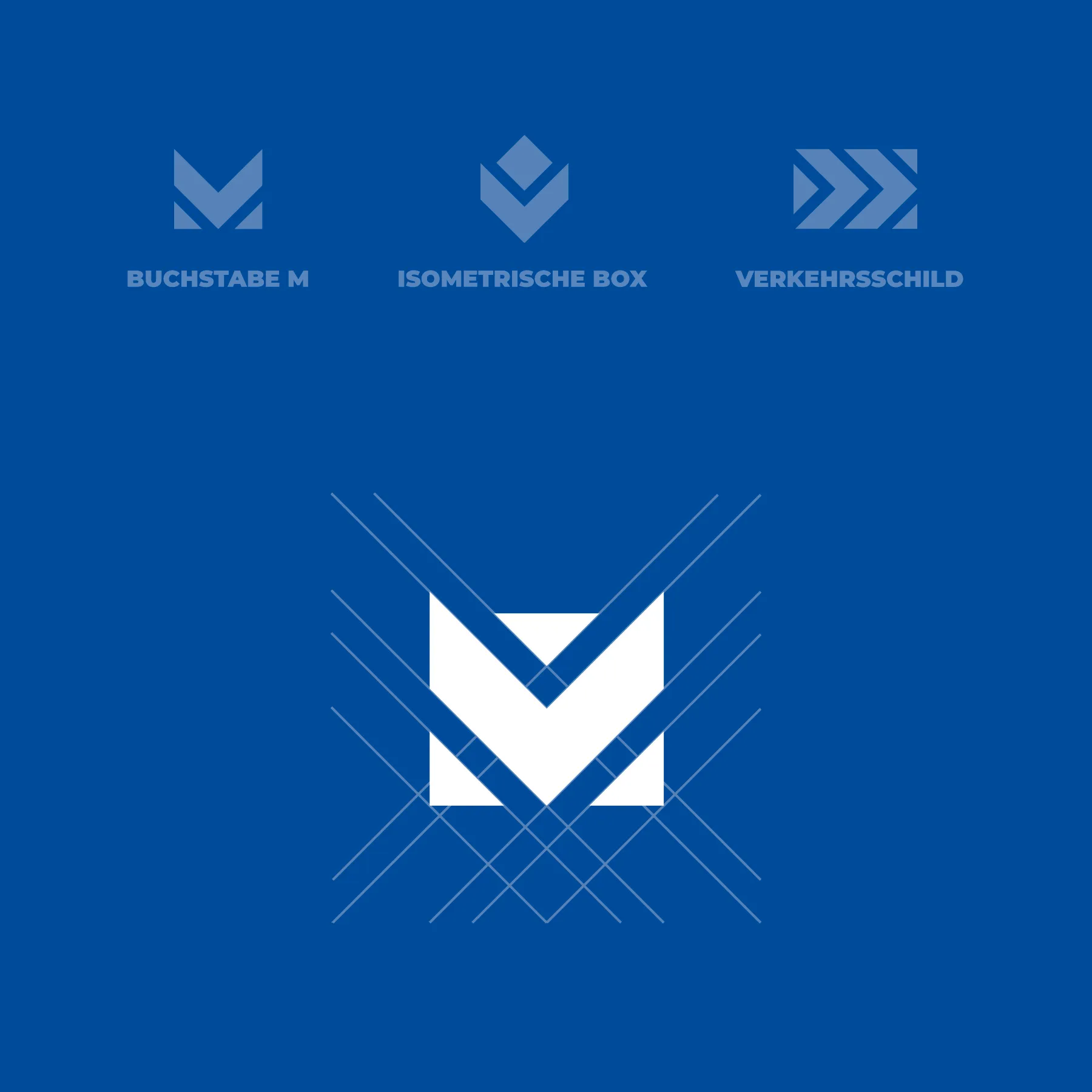
Solution
We built a geometric logo around the letter “M” using isometric shapes and directional cues to convey movement and structure. The design, paired with a strong blue palette and bold typography, delivers a confident brand system ready for both digital and physical rollout.
GAllery


CONTACT INFO
North Macedonia

