
BDB bau
BDB BAU
BRANDING
Challenge
BDB Bau GmbH, a German construction company, needed a modern visual identity that respected its industrial roots. They sought a logo that subtly referenced construction machinery—specifically a concrete mixer—while maintaining a professional and versatile brand presence.
Goal
To create a brand identity that stayed grounded in construction heritage while feeling refined and distinctive. The system needed to communicate reliability and precision without losing visual adaptability across print and digital platforms.
Solution
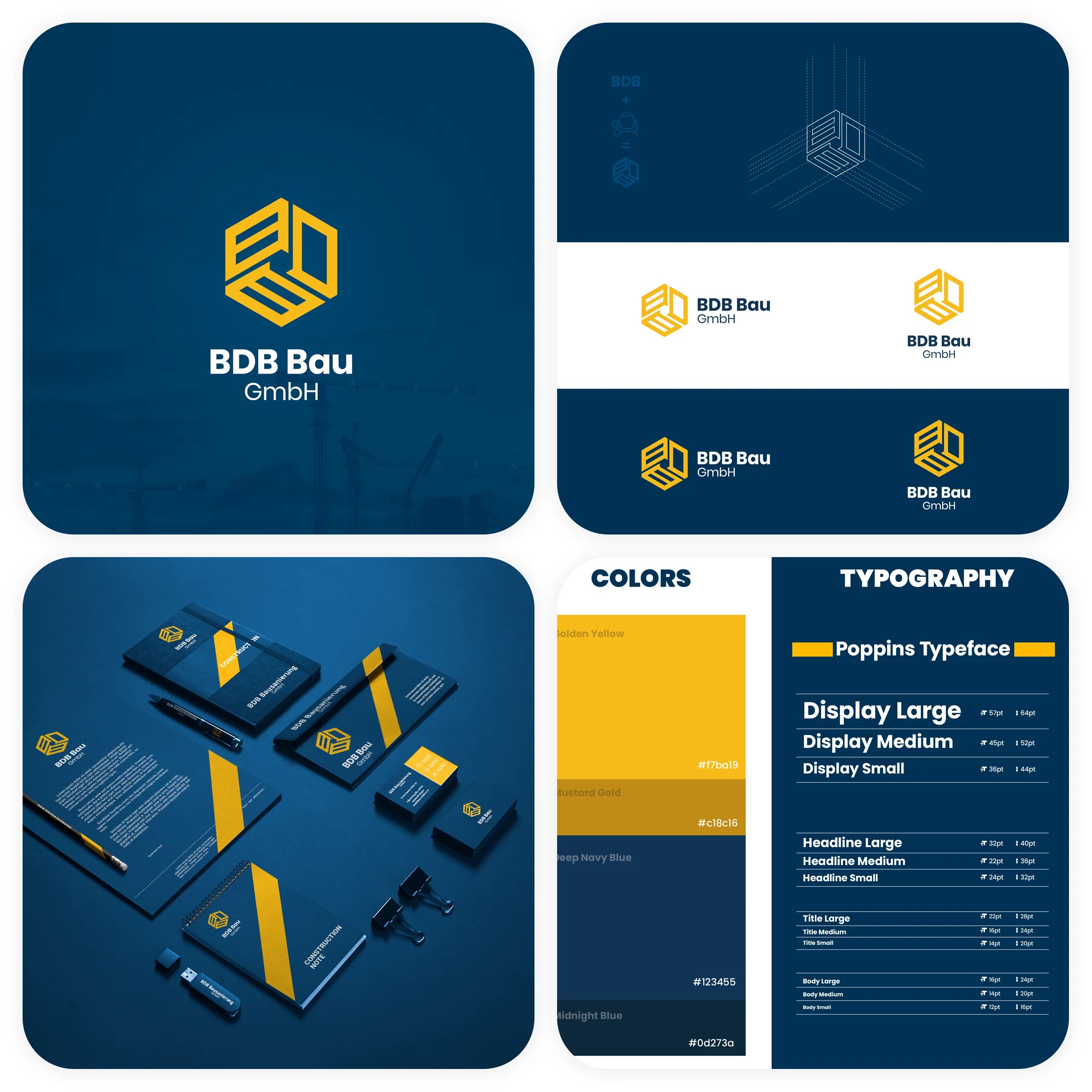
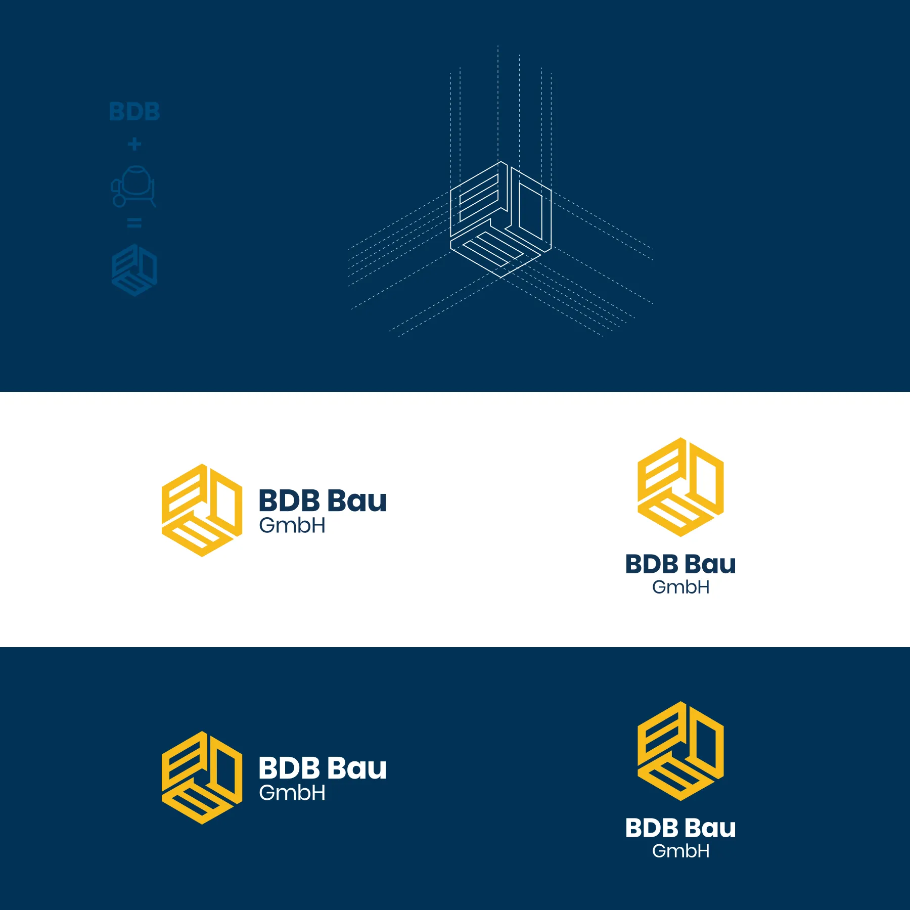
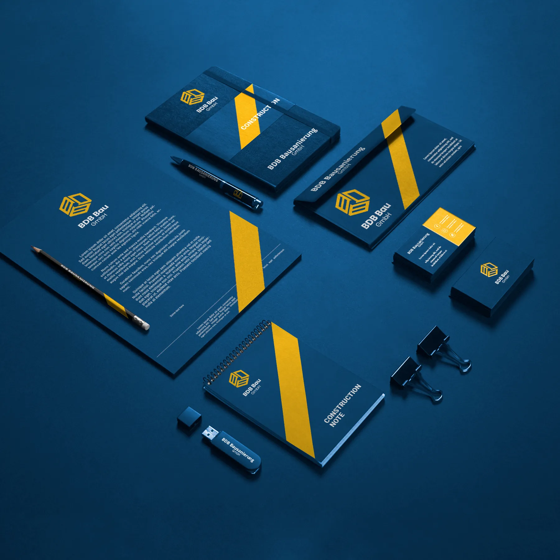
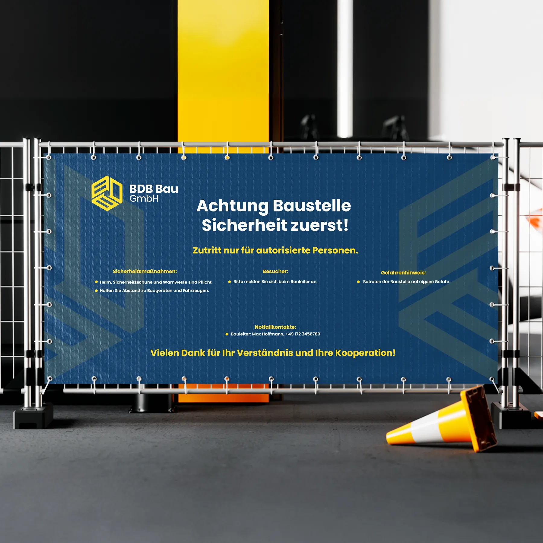
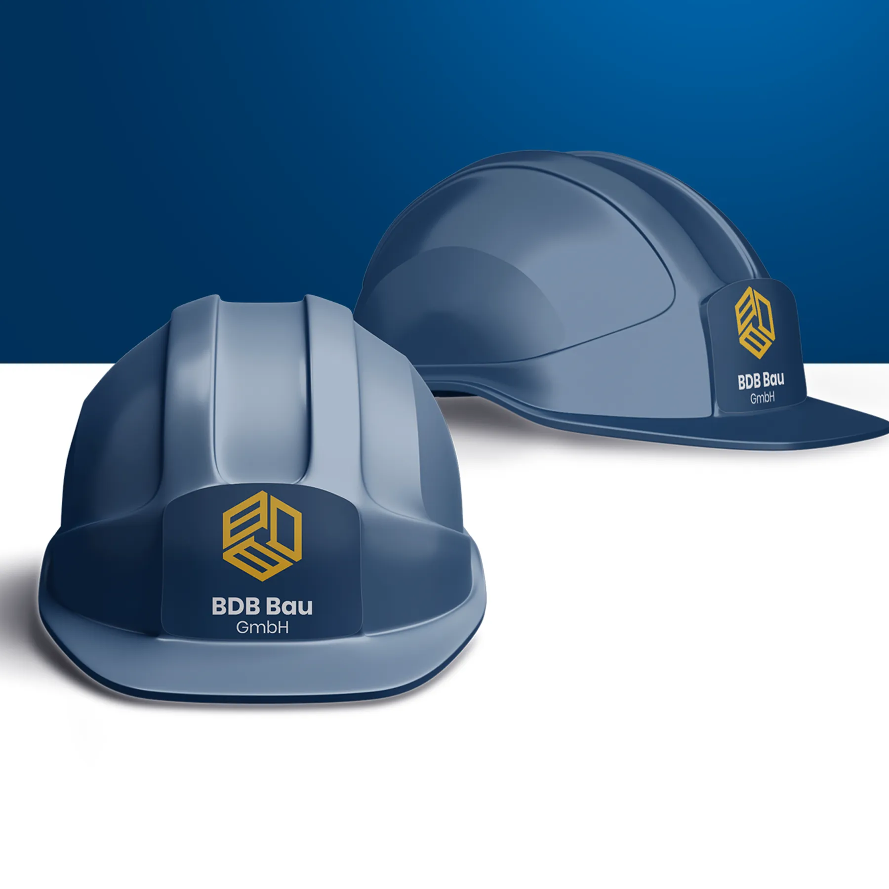
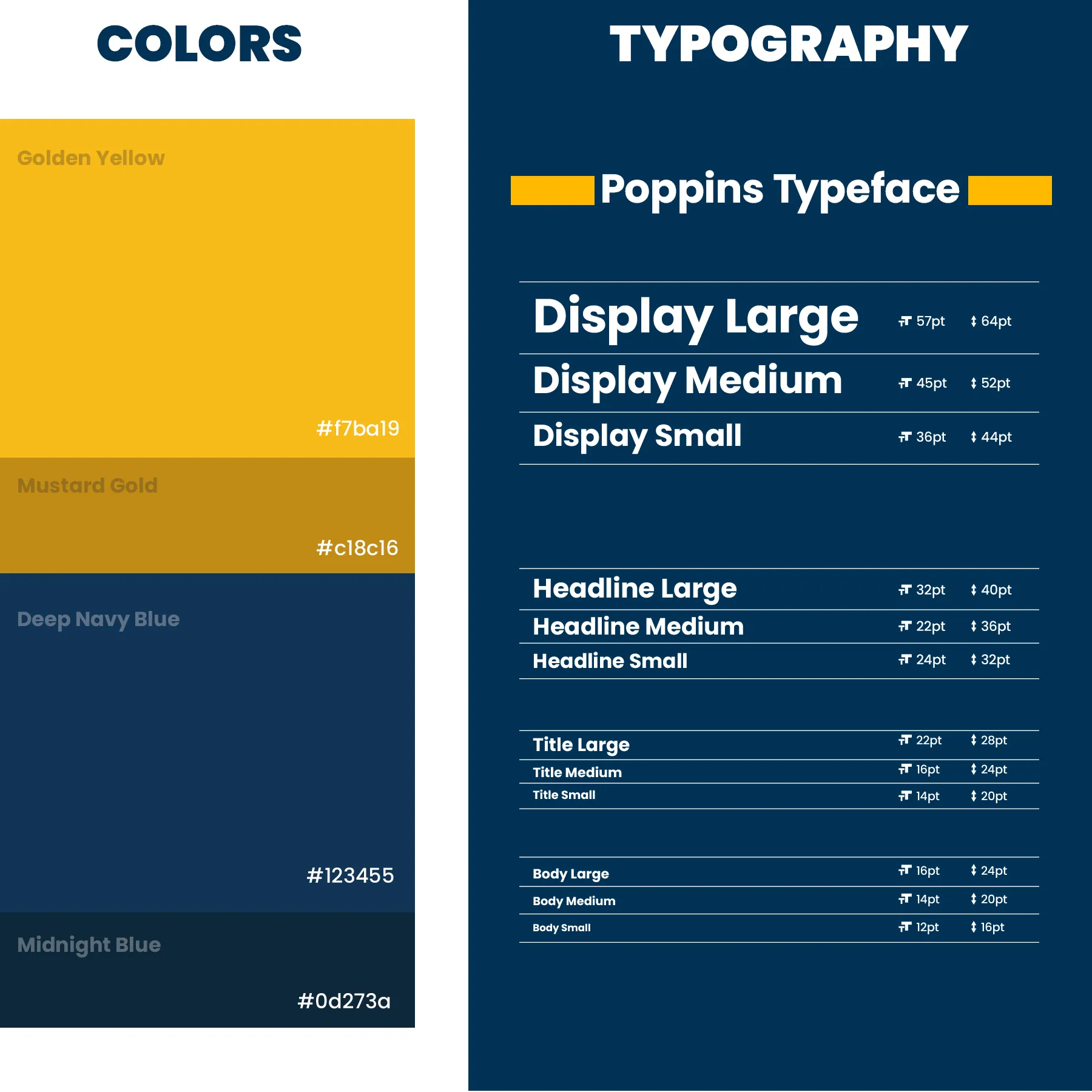
We built a hexagonal logo mark that subtly integrates the letters B, D, and B into a concrete drum silhouette. Using an isometric design approach, we emphasized structure, balance, and engineering clarity. A bold color palette of navy and industrial yellow, clean typography, and versatile applications—like branded helmets and signage—position BDB Bau as a serious, design-forward player in the construction industry.
GAllery


CONTACT INFO
North Macedonia

